Wednesday, April 29, 2015
Micro-Agression experience
I dont think that i've ever experienced a micro-aggression that has upset me very much, however i've always been asked a certain question several times by people. Because i was born in Australia and lived in London i tell people im either English or Australian (or both) because those are the places i connect to the most and where my family lives. However, i have Spanish and Argentine heritage and that is why i have dark hair and olive skin (typical Spaniard/ Argentine). People have asked me where im from and ill tell them Australia or England and there have been times when they've have said, 'you dont look Australian or English' or something like 'you have really dark hair, where are you from?'. It doesn't offend me usually but sometimes people can word their questions very rudely and in some cases it can really hurt ones feelings.

Friday, March 13, 2015
5 covers that catch my eye
1. 2. 3. 4.


5.

1. I like the idea of putting a young woman with a sad face on the front cover to represent the story of the book- about a daughter.
2. The design of this book perfectly matches the title. The design looks like tree branches which makes sense because the title gives the impression the story will be set in the woods.
3.When I think of a Queen I usually think of England. The title seems a litte rebellious so when this cover was designed it would make sense for it to seem a little silly.
4. I like how the cover of this book perfectly fits the title. Wall Street is a very known street in America, so i like the fact this title includes the American flag. I also like how many buildings surround the sides of the book which indicate the businesses that fill Wall Street.
5. This is a very good image for the book! It directly relates to the idea of the book.
Thursday, March 12, 2015
Favorite Book- cover

February Break picture


Tuesday, March 10, 2015
Logo Reflection
The most challenging aspect of this project was deciding how I was going to make the building- if i was going to use an image off the internet or create it myself. I decided to create it myself using the line segment tool. This part was a little challenging because i had to use it to create each line of the building, but overall it wasn't that challenging. To make this less challenging i used the arc tool to make the lines curve in the places i needed. The most successful part of my project was creating the pillars. I am very proud of how they turned out because overall it makes my project look complete.
Wednesday, February 25, 2015

Thursday, February 5, 2015
Art Work at the MoMA

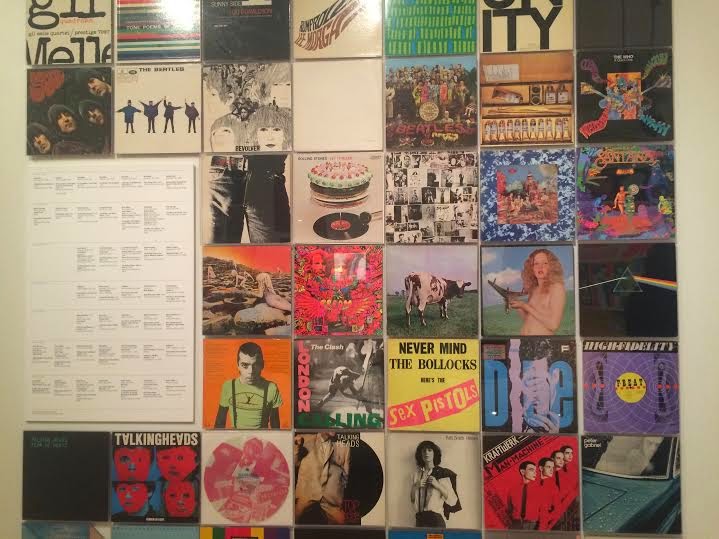
Over regents week i went to the MoMA and saw this exhibition that displayed cover photos from very famous artists and bands from the 60's, 70's and 80's. I really liked how they put the album covers all together on one wall. It grabbed my attention because it was so colorful and different from what a simple album cover would look like. They had layers over layers of different materials and colors/patterns that really grabbed my attention. Now that technology has advanced, we usually see album covers on our small screens on our phone or computer however it was nice to appreciate what album covers once represented in society and how they were an important part in how people perceived an album to sound like.
Friday, December 19, 2014
Questions for Greek Club
What activities do you participate in?
What is your objective for the club?
When do you meet and time?
Why do you recommend the Greek Club?
What is your objective for the club?
When do you meet and time?
Why do you recommend the Greek Club?

If i were a font!
Gabby
Fernandez
If I were a font it would be Jazz LET.
I like this font because this font reminds me of the 20’s, my favorite time
period in America. I like how this font in bold and is sans serif. I also like
how it is thin in some areas. I feel as though this font makes a bold statement
similar to how I like to make with my outfits.

Wednesday, December 17, 2014
Favorite Logos
The Adidas logo is my favorite and most common logo i wear. I really like how this logo includes the brandname alongside this unique image/symbol. The 3 stripes are found in many of Adidas' clothes and I really like how they incorporated the stripes into this symbol as well.

This IDEA logo is so clever! I really like the fact that they included an image to replace the letter. They used a bulb to replace the "i" which is very smart and witty since light bulbs usually represent new ideas.

This IDEA logo is so clever! I really like the fact that they included an image to replace the letter. They used a bulb to replace the "i" which is very smart and witty since light bulbs usually represent new ideas.
Monday, December 15, 2014


Wednesday, November 19, 2014
My scary ghost/vampire halloween symbol GIF!

Reflection:
This project was very stressful in the beginning. I did not have a clear picture of what I was going to be drawing/creating for my symbol. However, once I had my idea, creating it with multiple layers was very difficult for me. I was confused about layers, and the amount made, would create an image and how I needed to organize my layers in order to create a cohesive gif. I also struggled a bit with making the body of the ghost translucent with the opacity tool. I feel that I have definitely improved with layers, because although it was a struggle for me in the beginning I seemed to understand it a lot better as I continued with the project. I wish that I was better at making pictures on photoshop with the paintbrush tools and the marquee tool in order for them to be clean and clear. I am actually really excited to create something new and better on photoshop. I would love to use photos next time to create gifs.
Thursday, November 13, 2014
Concept Board

Roy Lichtenstein was an American pop artist born in 1923. He was among the many artists such as Andy Warhol, Jasper Johns and others who became leaders in a new art movement during the 1960's. In this period of time, political, economic and social changes were occurring in the United States such as, JFK's assassination, the Civil Rights Act, Communistic countries, postwar effects and more. The United States had also entered a period of wealth. Consumerism was high and new advances were developing. People were becoming modernists, such as women who began wearing pants and red lipstick. Roy Lichtenstein embraced this new culture and evoked this sense of consumerism and modernism into his work. He was influenced by advertising and comic books, which are clearly shown in his art. His work conveys messages of modern relationships- and their tragedy, they depict the issues (in a funny parody way) that people in relationships have.
Wednesday, October 29, 2014

Thursday, October 2, 2014
Inspiration
My inspiration is the world, the cultures in each country, city, town, village, etc. I love to travel, it is something i would love to pursue for the rest of my life. Just being able to embrace yourself in another country and let all the beautiful surroundings make you feel happy to be apart of this world. Traveling makes me appreciate what i have, it also reminds me of how diverse and amazing this world is- what people have made from it. Right now my friend and I are saving up to go on a European tour, it would be amazing to visit all those countries and discover more beautiful places. One of the most amazing places i have been to is in Argentina. We went to visit this wine town, but the view was amazing, there were mountains surrounding us. And at night it was so dark, it was so easy to see the stars, we even saw a shooting star! Here is a picture:

Letter Project Reflection
1. I feel that drawing the outline of the figure was quiet difficult and took the longest amount of time, as i constantly had to erase and redraw certain parts. I enjoyed the amount of time we had in class to work on it by first creating 20 thumbnail sketches to generate ideas. By doing this it helped me grasp onto the idea of Mermaids and the Ocean's colors. When i began to use the watercolor, i loved painting the tail different shades of blue and green to emphasize the Oceans vibrant shades.
2. I've always admired Mermaids, ever since i was as little as i can remember. Mermaids have always been a representation of beauty and vibrancy. I love the shape of the letter "S" so i derived my idea by thinking about what forms could make "S", and Mermaids had popped into my head. I have always drawn Mermaids, so this type of pose seemed perfect for the Mermaid to make to form the letter. The way that her tail curves at the bottom and her hair flows up to form the top section of "S".
3. The most challenging part of this project was the watercoloring. Although i enjoy watercolor very much, i am still working on my techniques. I did mess up a few times around the face area, and that is something i would like to improve on- details.
4. I am satisfied with my project, although i feel that i should have spent more time on the watercolor, i like how the colors on the tail came out.
5. I would definitely try to change the background or add something to it in order to make it blend in or match with the image in some way.
Here is the final product (I took a picture of the before, but it got deleted somehow on my phone):
Hey!!!! I'm Gabby.
I am very interested in the fashion/beauty world. My favorite shows are The Blacklist, The Fosters, Finding Carter, Law and Order: SVU, and more that I cant think of.
My favorite musical artist changes all the time. I really like Rihanna, The Neighbourhood, The 1975, Coldplay, Kanye, Drake, and more. Obviously, one of my favorite movies is Titanic, but also scary movies such as the conjuring.
My favorite designer is probably Chanel. I love their style and her legacy. Even though I cant afford anything from there i still admire is very much!
My favorite lunch spot is pret! But on really sunny days my friend and i love to sit on the benches on the block across the school. Gregorys coffee also has really good hot chocolate!
On my blog you will expect to see exciting, fashionable interesting and colorful images.
Thursday, September 18, 2014
Subscribe to:
Posts (Atom)